In today’s world, where attention spans are fleeting, and competition for user engagement is fierce, creating a functional and visually appealing website has become more critical than ever. A well-designed website captures attention and guides users effortlessly through its content. One of the key principles behind achieving this is visual hierarchy. This design concept uses strategic placement and emphasis on elements to prioritize information and guide user attention and navigation. This article will explore the importance of visual hierarchy and the essential design elements that contribute to its success.
Understanding Visual Hierarchy
Visual hierarchy refers to the arrangement and organization of elements on a web page to communicate the relative importance of each component and guide users through the content in a structured manner. By employing principles such as size, color, contrast, spacing, and typography, visual hierarchy can effectively direct user attention and ensure a seamless browsing experience.
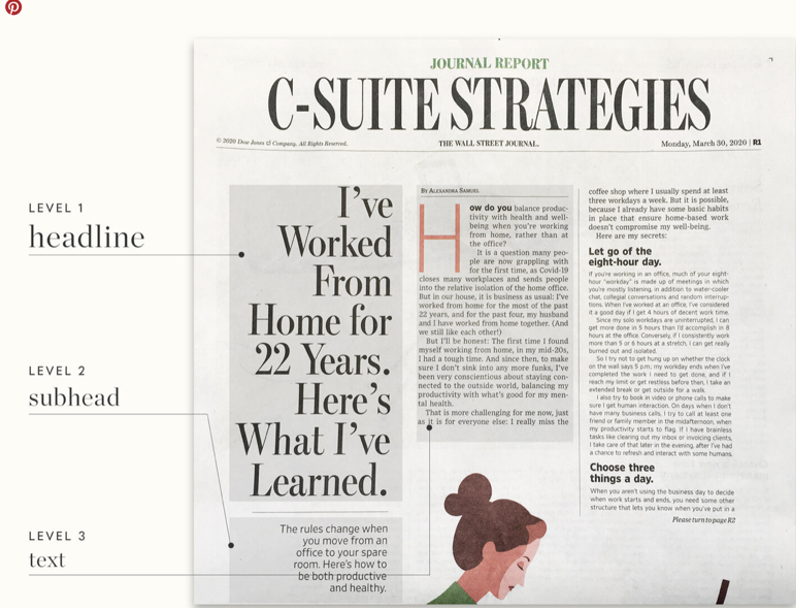
Size and Proportions
Size plays a crucial role in creating a visual hierarchy. Larger elements tend to grab attention first, conveying their significance. By appropriately scaling and proportioning different aspects, you can effectively communicate their importance and guide users to focus on crucial information. For example, use larger headings, prominent images, or bold typography to emphasize critical content, while smaller elements can be reserved for secondary or supporting information.
Color and Contrast
Color and contrast are detrimental for creating visual impact and guiding user attention. Vibrant or contrasting colors draw the eye, while subtle or harmonious color schemes create a sense of balance and cohesion. Highlight important buttons, links, or calls to action with colors that contrast to make them stand out. Ensure that the color choices align with your brand identity and provide a pleasant visual experience for your users.
Whitespace and Negative Space
Whitespace, commonly referred to as negative space, encompasses the vacant areas that exist between design elements. It provides a visual breathing room and helps separate and organize content. By strategically utilizing whitespace, you can enhance the clarity and legibility of your website. A generous amount of whitespace around essential elements makes them stand out and improves overall user comprehension and navigation.
Typography and Readability
The typography you choose greatly impacts the readability and hierarchy of your content. Opt for fonts that offer readability and clear differentiation between various levels of hierarchy. For example, use larger font sizes and bolder weights for headlines or important sections while keeping the body text at a comfortable reading size. Consistency in typography across your website helps establish a coherent visual language and improves user comprehension.
Imagery and Visual Cues
Images, illustrations, and other visual cues guide user attention and navigation. Relevant and eye-catching visuals can draw users into your content and help them navigate the website. Use imagery strategically to create focal points, direct attention, and support the narrative. Carefully select visuals that align with your brand and enhance the user experience.
Navigation and Call-to-Action (CTA) Placement
Smooth and intuitive navigation is critical for a positive user experience. Well-designed menus and navigation bars should be prominently positioned and easily accessible, allowing users to explore your website effortlessly. Similarly, strategically placed and visually distinct call-to-action buttons help guide users toward desired actions, such as signing up for a newsletter or purchasing. Ensure that navigation elements and CTAs stand out without overwhelming the overall design.
Creating an effective website involves more than just aesthetic appeal; it requires careful consideration of visual hierarchy and design elements to guide user attention and facilitate navigation. You can create a compelling and user-friendly website by understanding the principles of visual hierarchy and implementing them through size, color, contrast, whitespace, typography, imagery, and navigation. Remember, a well-designed website captures not only attention but also guides.